Tuesday, 6 November 2012

Print Making


Print Making
6th November 2012

Above are 3 very different prints. I have used various mono printing techniques to create my images.

We started off with a thin layer of an oil based ink on a flat surface. We then drew out some images on A4 sized news print paper. We then placed our image; face up, on the thin layer off ink. When the face up image was traced it left an impression on the news print.

My favourite thing about using this technique is that you can get a nice even colour. So it makes certain types of images really easy to draw. You can also create a lot of copies of the same image really easily at the same quality which is one of the reasons this technique is used so much.

The first print we did (top right) is a print we made were we were only able to use one colour so I decided to draw a skyline in the style of Jean Michel Basquiat. I deliberately made this image look scrappy and rushed because that is his style.

The second image (middle) is by far my favourite. It is a character created by Jean Michel Basquiat. I used all the same techniques that I had for the previous image but this time had added a bit of colour to make it stand out a bit more.

The far left is my least favourite as, but what i did was I used tissue to create a background. I made it in the weave style because Jean Michel Basquiat draws a lot of these random weaves in his work. The print quality of this image was a little poor because the ink wouldn’t transfer much due to the thicker paper.

Print Making

Thursday, 18 October 2012

Chris Dent


Chris Dent does a lot of illustrations that have the common theme of cityscapes and buildings


The image is very busy not just by the people in it but by the amount of lines and the amount of detail that is in the frame. He uses very linear and fairly thin lines when making his drawings and most of them feature cities.
In this image he has put white blurry marks over the black, I think he has tried to make it look like snow and that it suggests its in the winter. There is also a Santa Claus in the foreground which makes me think it is meant to be New York City on Christmas Day.
I really like how busy it is and that  he manages to add depth without using colours. Its mass amount of detail is something that makes this image so good in my eyes.

Tommy Penton

Tommy Penton.

 Tommy Penton is an illustrator and painter.

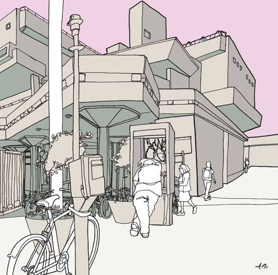
Hayward
Acrylic on Board 
76x65 cm 

I like that even though this has been painted he still manages to make a vector illustration. I like how the picture uses block colours but you can still see shading and light areas. I also really like how he hasn't tried to make the image look too realistic and that he hasn't added too much detail

Because of the angle this picture is drawn at it gives the impression that the building is really big and complex.


Olivier Kugler

Oliver Kugler.

 Oliver Kugler is a graphic based artist who uses draws a lot using vector tools.
He does line drawings by hand and then goes over them using software like Illustrator. He then adds colour.

By using vectors it prevents the his image from loosing quality. If it was to be scaled up it would not become pixelated and blurry this is because vectors are not pixels and so they can be re scaled at any time.

I really like how he has drawn this picture . I like how he has used a much brighter colour to the object in the middle this instantly draws the viewer to it. By using  different colours for different parts it makes it easier to se the different subjects of the drawing. I like that even though the colours are very flat and of a single bold tone he still manages to create depth with the little shading he uses. i also think the plain colours gives the image a nice look because it complements the mass amount of detail.